Introduction
The following is a list of the games I wrote for the Amiga 500 computer, when I was around 14-18 years old. In order to play these games on a modern computer an Amiga emulator is required (eg, Win UAE)
Games I have copies of:
- Stomper
- Tunnel Run
- Odd One Out
- Two of a Kind
- Toxic Waste
- PopCycle (to come)
- MineDuster (to come)
- Augmentia (to come)
- RPG Game engine (to come)
Games lost (due to disk failure, or burglury).
- The Letterbox Game (a two player game where players move their letterbox around a chess board, in the style of a knight, trying to collect mail).
- A sideways scrolling shoot-em-up about a Penguin (I think)
- A Zolyx/Qix clone
- The drawing tools used to draw the graphics, and design the levels (CrapEd, MegaEd, MegaAnim, and MegaMap)
Stomper (1993)
The first significant game I wrote for the Amiga was "Stomper", a game which made me a smooth $150 all up (I sold it for $10 a copy at a computer club open day...). I used the money to buy a sound-sampler (a device for digitising sounds, built-in to PCs now days).
Stomper was like a Pacman type game, except that the enemies couldn't be killed (power pills turned them into harmless Christmas trees temporarily), and there were 20 different levels, with a few puzzles (through switches, teleporters, and fake walls), and five different "worlds" (Dungeon, Cheese, Drain, Ice, Crazy). When you died you when to heaven, and the "plot" revolved around Rolf Harris (regrettably given the truth about him).
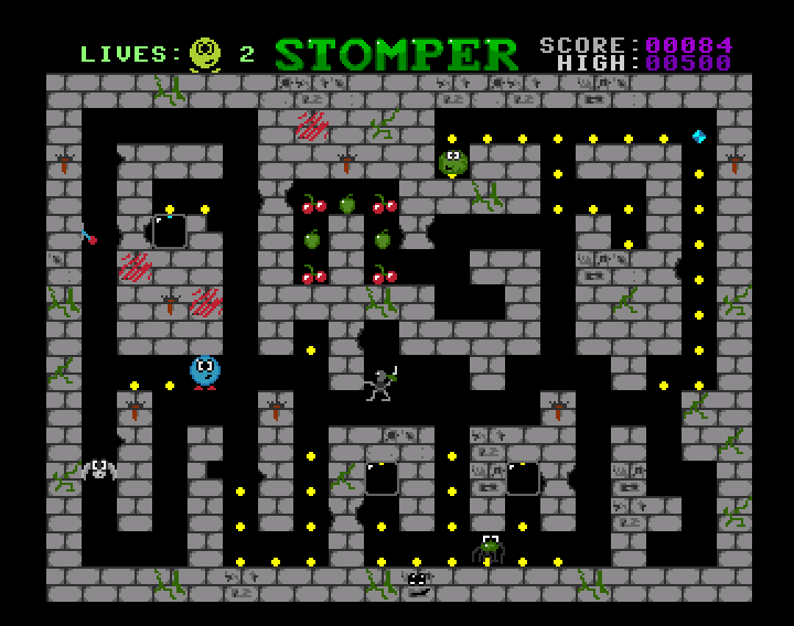
The main character is the blue circle with the red shoes. They are supposed to be stomping the yellow dots (the sounds are sort of stompyish).
It was originally meant to be a two player game but my attention span wasn't long enough for implementing that. There were quite a few "bad guys" that appeared over the game but my favourite was always the spider (and one of the cheeses in the cheese world). It was heavily influenced by the game Super Frog which was my favourite game at the time.
So, here are some screenshots!
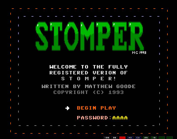
First the title screen. There was a "free" version, which just had the first few levels.
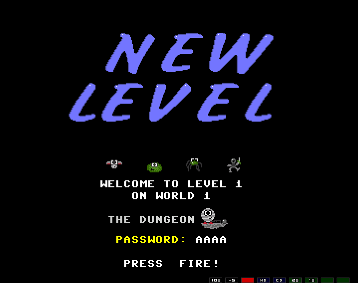
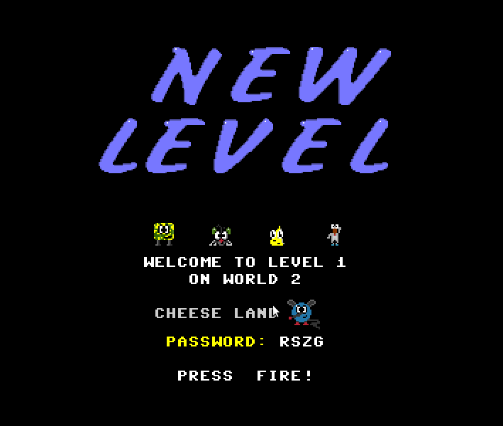
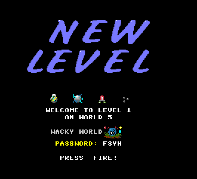
The new level intro screen (the baddies on the level are shown here doing their thing). The password feature, as well as a giant flashing arrow in the game, were added in later revisions due to user feedback (because I care). The general font used is that used by the Commodore 64.
The very first level I think.
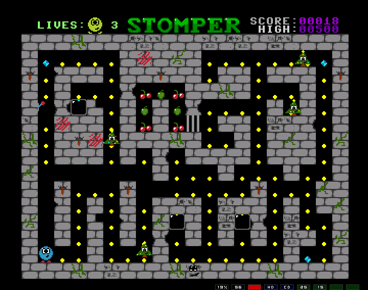
Power pill = Xmas trees. It was too much bother for me to program death of the characters, so they just turn to Xmas trees instead (for a short time), when they cannot harm to player.
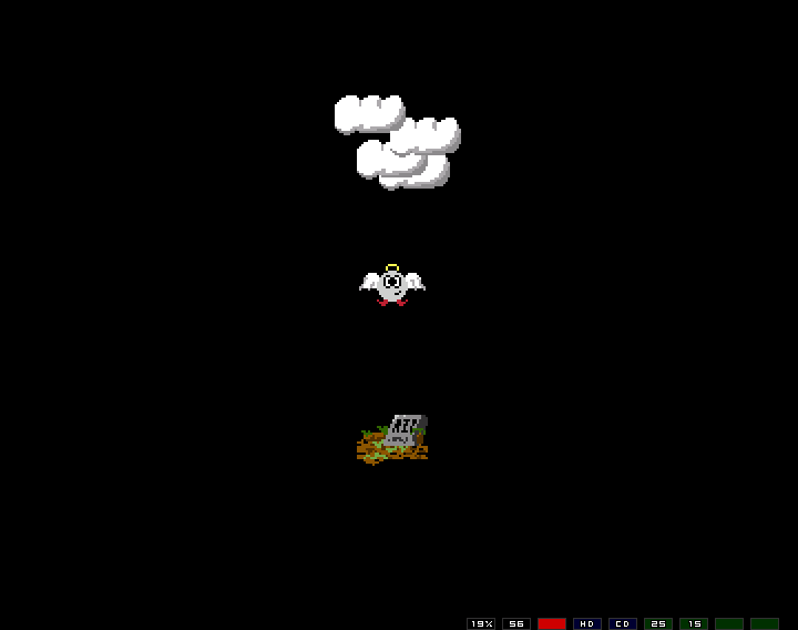
When you lose all your lives you fly up to heaven, which is sort of funny considering. I was quite proud of the flappying wing animation.
Cheese world...
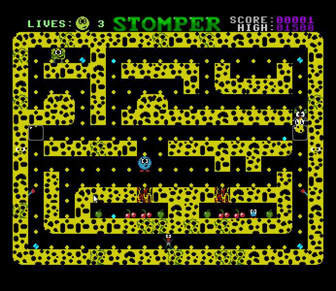
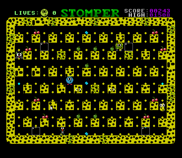
The first or second cheese world is the first to include a homing enemy. The homing logic was a bit poor but if the enemy moved at the same speed as the player then they were very hard to avoid. Of the few instances of homing enemies, most are half speed ones.
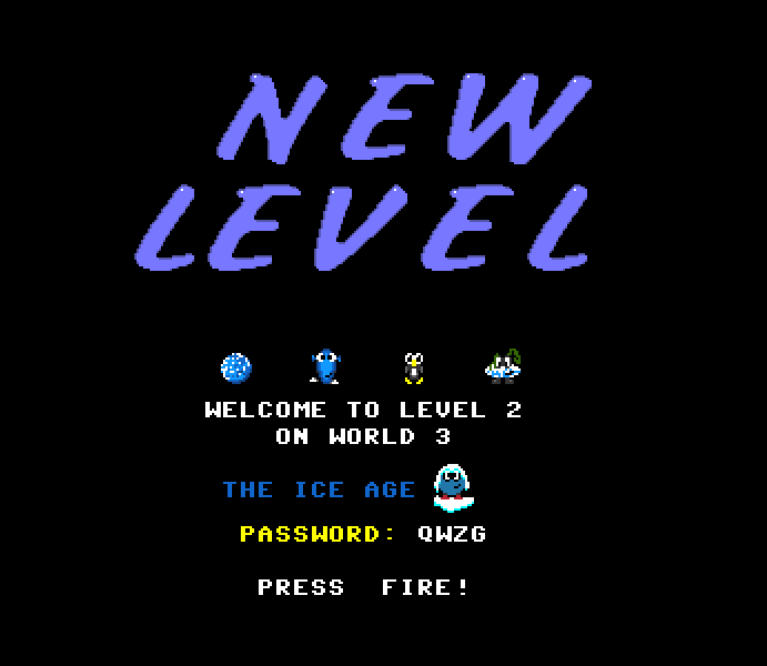
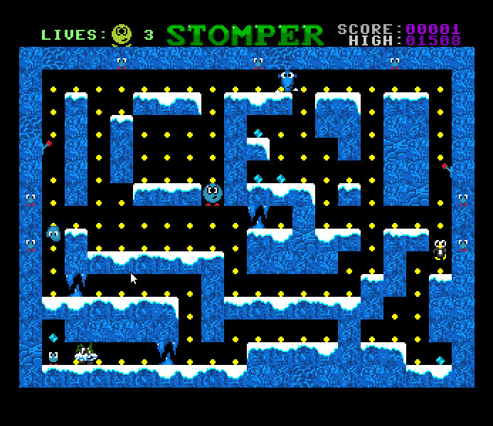
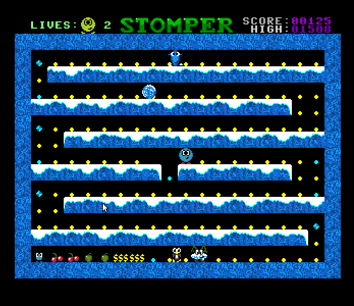
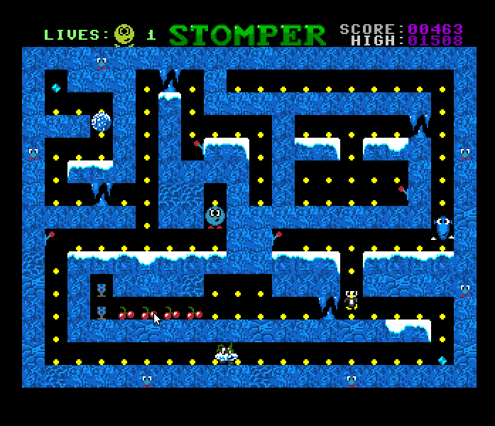
Ice world...
Pipe world...
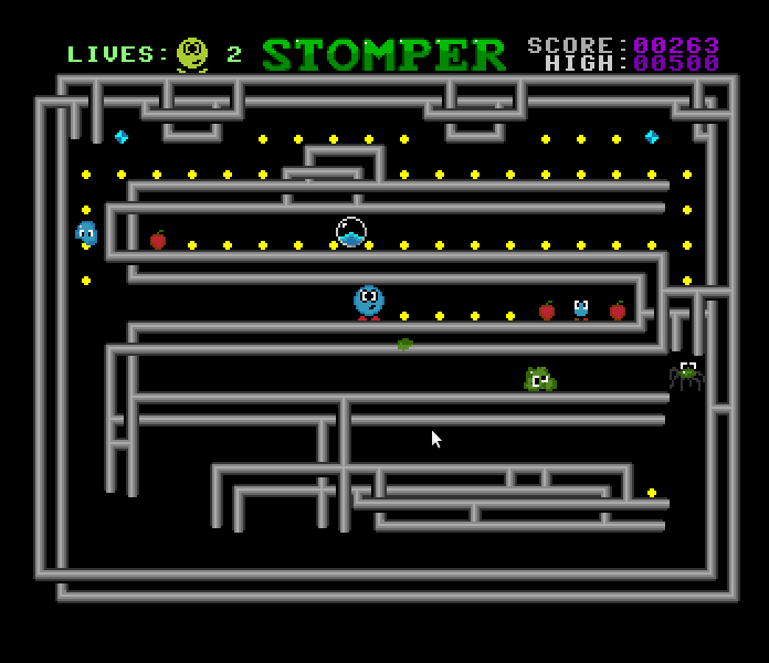
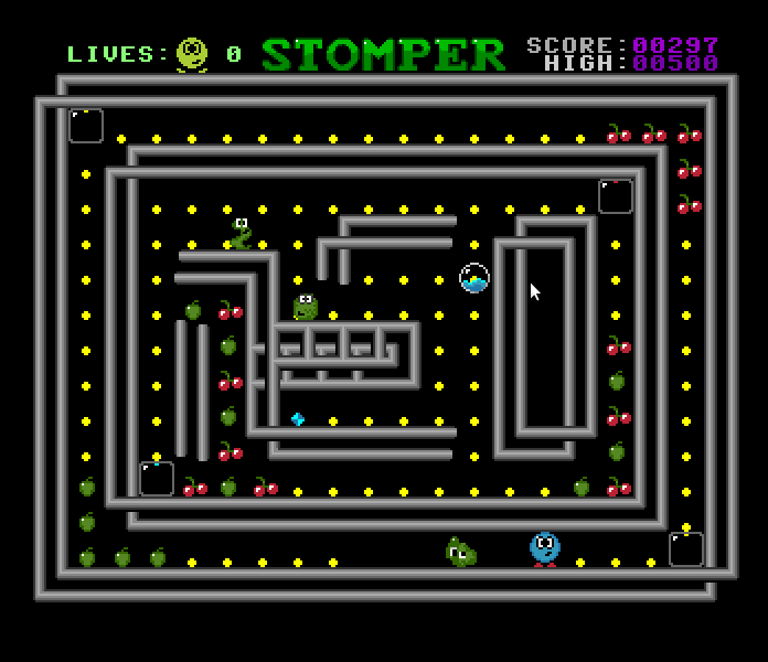
Crazy world...
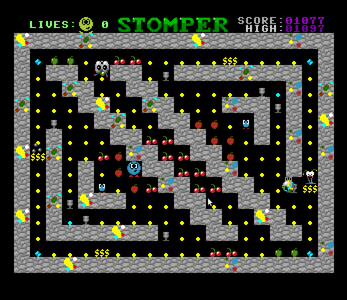
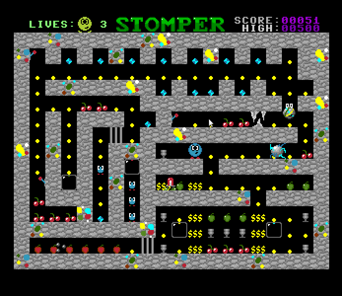
While this is quite a simple game, and terribly programmed, it had the most scope of anything I actually finished. One of my "treasured moments" in life is when at a later date a kid came up to me (at a meeting of the aforementioned computer club) and proudly boasted that he had clocked my game. I didn't actually think anyone would be crazy enough to stick with it long enough to do that (and the last level is a shitter), so that was touching. I don't know if the version he had had passwords or not (most versions I sold did not have a high score table, or password, or "giant flashing arrows" - you need to play the game to understand the last bit). If not, that would make things all the more impressive.
You can download the game "Stomper" from here.
The original documentation file that came with the game can be found here.
Tunnel Run (1994)
So, after Stomper, I felt the need to write something nice and simple. And I wanted to make a 3D game that ran smoothly on a base Amiga 500 (remember this is before all computers ran 3D smoothly). So I came up with Tunnel Run, with 3D so simple it was (a) smooth, and (b) actually within my abilities. Thing was, I didn't actually know anything about 3D programming. I just guessed the projection equation, which isn't hard — x' = x/z, y' = y/z — no rotation or anything, and that was enough for an exciting trip through warpy space. (My practice assembler programming on the Amiga was writing 3D starfields — the thing to do at the time, so this is just an extension of the same principles).
But let's see the all important title page first...
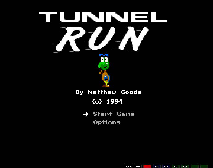
Wow, you might say, that's one amazing piece of artwork! Why I'd just finished school C art you know...
There were also some options:
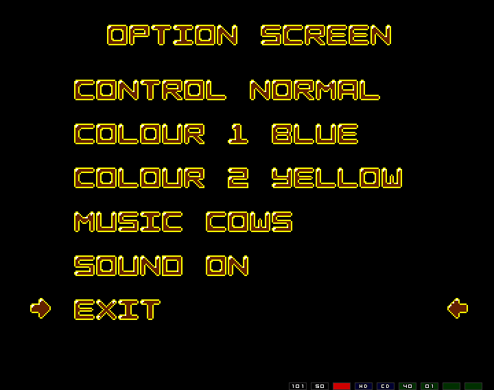
The sound is obvious, but why would you want to turn the sound off? Well, mainly for the music, in this case Cows which I sampled off my casio keyboard. Yes, it just loops like that FOREVER!! There were two other bits of "music", another rip from my keyboard, and a short loop from some song I got off the radio.
Now, Prepare to play! (yes, that's me talking - in a "funny" voice).
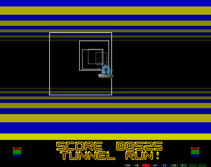
Looking fancy there, and now you can see the effect of the colour choices (yellow and blue you may remember). Notice the incredibly complex graphics involving complicated "vertical", and "horizontal" lines. In fact the first version of the code used general line drawing code - and only ran at 25 frames per second. I later changed that to more efficient, l less general, code and got 50 fps (AMAZING!). Also, due to quirks in how the lines were drawn (and the way images are stored in an Aminga), the lines creating a nice sparkle effect (just noticable).
The point of the game, of course, was to stay within the confines of the squares moving towards your UFO. Every time a square passes and the player is on the outside (or collides) an energy bar (lower left/right) is lost — until death. Each square progressively gets further apart.
For example, in the following the player is not doing too well (and look at the turning graphic — I spent time on that you know).
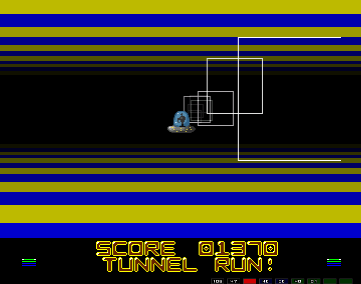
The explosion when you ran out of energy wasn't too bad actually (relatively speaking), and I was quite proud of my effort.
Upon running out of energy it would be Game Over! (me again, in funky digitally altered sound), and if you were lucky than you'd find that You have acheived a high score!, as you can see I have (with the incredibly funny "plop" name).
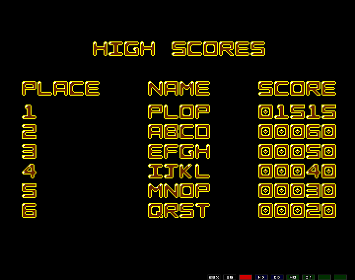
This was my first game to have a highscore table (that was saved to disk - a bigish thing in those days). Stomper had this added later (by incorporating the code from Tunnel Run).
And that was Tunnel Run, started I think soon after I finished School cert.
Tunnel Run can be downloaded from here,
Odd One Out
So after Tunnel Run I got crazy on the idea of writing educational games. So I went back to my old primary school, dragging a certain friend with me, to see if they wanted any education software developed for their Amiga computers (which I had chanced to see situated on the premises). Talking to an old teacher we got a suggestion to computerise a popular kids book, but in the end we didn't do that at all (though I did get somewhere doing the graphics - unfortunately lost to the winds of time...)
Anyhow, the result were two educational games, Odd One Out, and Two of Kind (brilliant names I know). Odd One Out is one of those "one of these things is not like the other" games. Very exciting.
The title screen was rather naff.
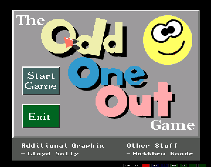
Unfortunately the mouse pointer doesn't show up correctly on the emulator I used for the screen shots, but the important thing to note is that it was rather oversized. I'd read some book on writing games for kids, and I'd managed to get the idea that big mouse pointers were "in". My efforts to get a friend involved weren't all that productive, though I did manage to get him to provide some of the graphics. Also, note the abundance of options, and then pretend we click on "Start Game". Doing so would then prompt the user for a difficulty level (1-4), and their name. I'd also read in said book that it was important to "personalise" the software. After all that, the user would be presented with a screen like this...
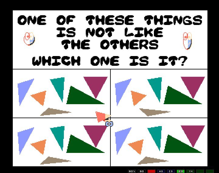
This is one of the more difficult ones (the first ones are like squares and circles, or differing colours). Again, the little bouncing balls do not translate well in the emulation - they were animated too! And the mouse pointer will blink. If the user selects the right choice, they got the following...
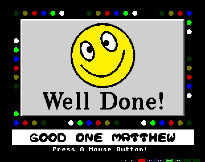
Again, with animated bright colours, and positive personalised messages, because of that book... It also played a sample of Stimpy (of Ren and Stimpy) saying "Oh Joy". If the user got it wrong though, then they got this...
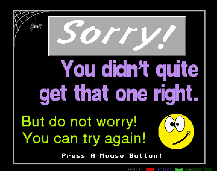
Of course, it's important to still be encouraging in such cases. Later puzzles were picture related, to show off my brilliant artistic talent!
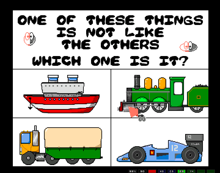
I even remember getting books out of the library to get pictures of planes and trains, etc, as models. There was a debate about why the boat was not actually the odd one out.
In the end, sufficient education would be provided to the child, and as a reward they got this...
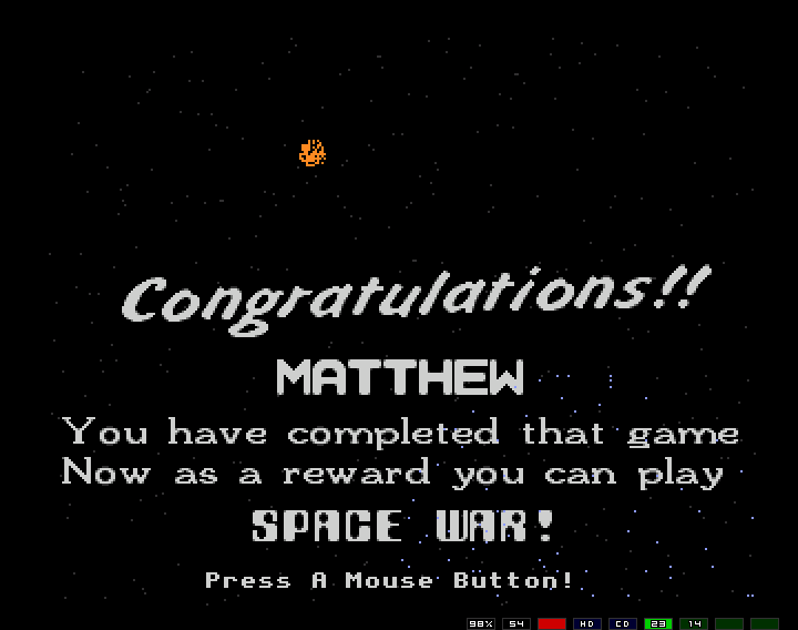
The little orange ball of pixels is the start of a firework explosion. I was quite proud of my fireworks as they didn't look too bad (ie, they looked like fireworks). They could have done with a "tail" but I didn't have the patience for such details. They also probably could have done with a better sound effect than me go "pauch!". You may also notice the reference to the real reward — Space War!
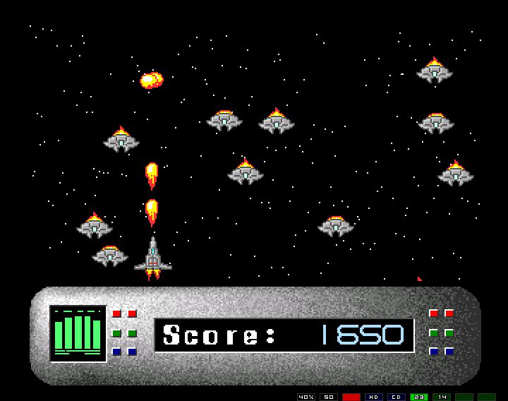
Space War being a very simple game, but one with a surprisingly effective "arcade" feel. The goal was simply to shoot as many aliens as possible, though you also got points for just avoiding them. It was easy to build up a good score pretty good because that's what the book said it should. Also note, the two space craft images, and the fireballs, are Lloyd's. There was also a nice female voice saying "Get Ready" before you started. The "control panel" was "vividly" animated. The sound effect for the fireball was me blowing into the microphone.
In the end you'd die and it'd be game over...
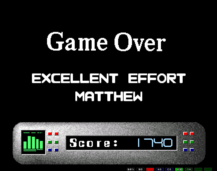
And again you can see the influence of books upon me...
The one time I saw a kid playing this game they pretty much sped through the "educational" part to play Space War. In all, it wasn't very educational at all (especially since there weren't that many puzzles).
The instructions that came with the software (spelling mistakes and all) can CAN BE FOUND HERE!
You can download the game "Odd One Out" from here.
Two of a Kind
The other educational game I wrote, which I sold to my old school and gave a copy to one other teacher, is the also rubbish named "Two of a Kind". It is not hard to guess what the point of this game is.
So, again with the large mouse pointer (but just you wait), and the sickly coulours - the title screen...
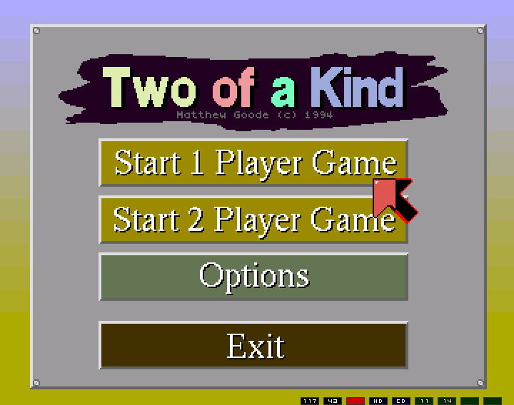
(funny pointer colours result of emulation...)
From the title screen one can choose either the one or two player gane, but let's not play the game just yet. First we will click on "Options".
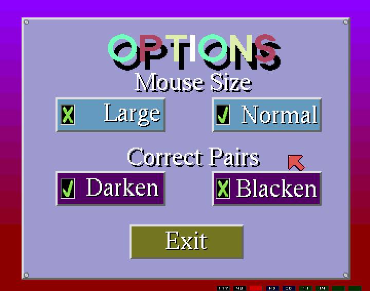
Look at those colours! (My stylistic choices have not altered much over the years).
Now we can see that the mouse pointer can be reduced to a slightly more manageable size (evident is the screenshot), but al so that we have the option to have correct pairs either become darker (you'll see), or black (which is very dull and boring). For the options, I have supplied almost nothing useful. Brilliant!
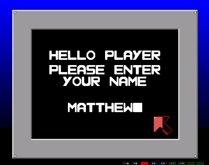
Once the game has been started, it's important to personalise for the individual user, so they feel connected...
After this the difficulty can be set...
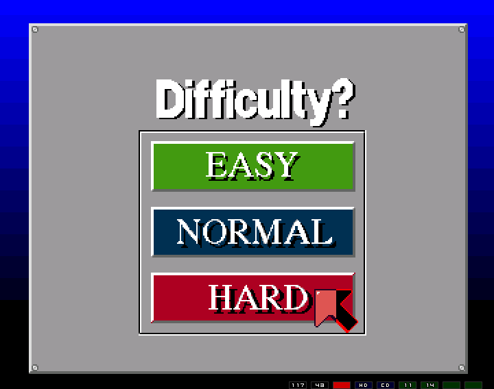
... which is actually useful, and just refers to the total number of pairs.
Starting off (in normal difficulty) we have...
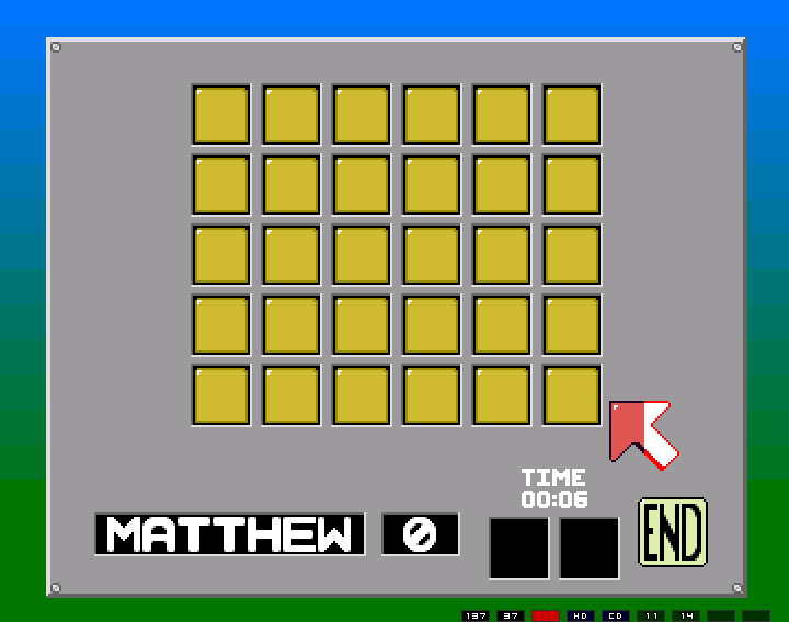
And now I choose a pair...
... but I suck...
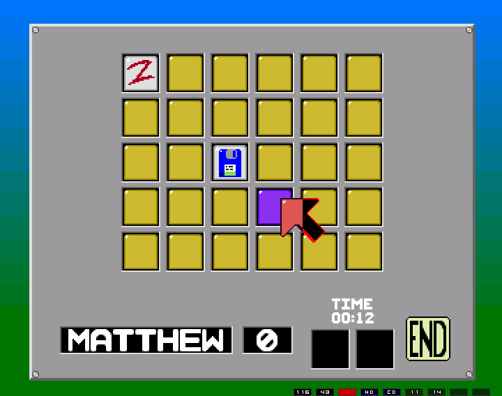
... until now. Notice the darkening, and not the blackening thanks to the selected options.
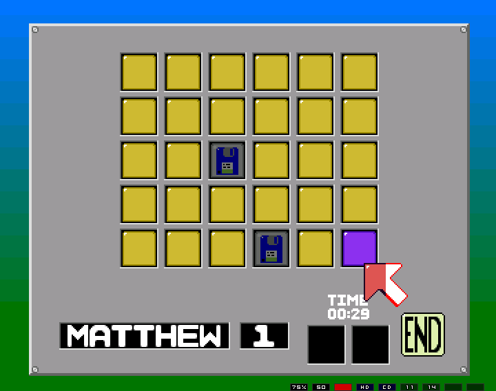
And now we are almost there...
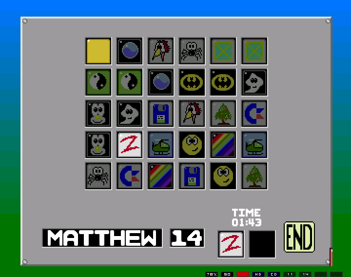
The pictures are animated too, via a technique called Colour Cycling. Once upon a time not all computers could display millions of colours at once. All they could do is display a limited number (like 16 or 256). If you were lucky, each colour in the current palette could be specified (unlike a C64 for example,where they were fixed), and if you changed that particular colour, in the colour lookup table, all instances of that palette choice would change at once. This allowed for simple tricks like flashing between colours (black to white here), and for pulsing effects. It is also how screens were faded to/from black, and so on, with very little computer effort.
I win!
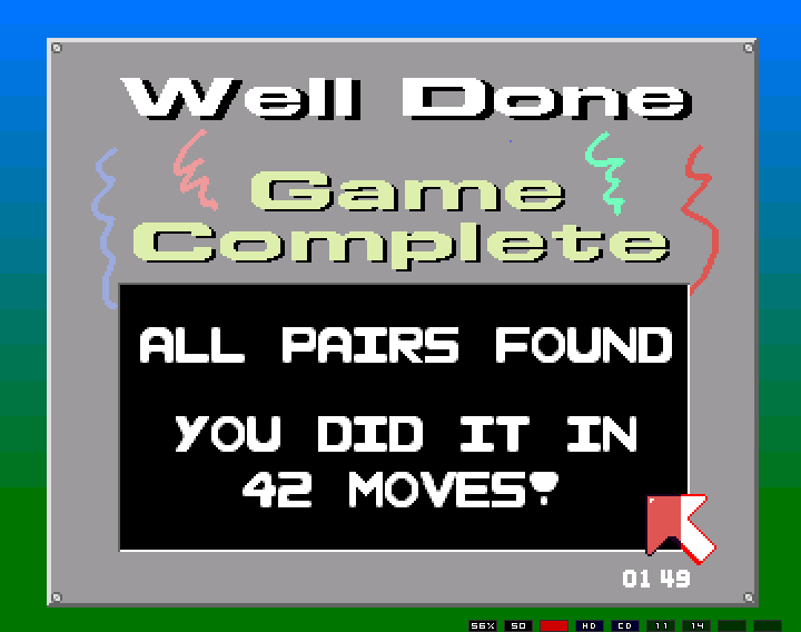
And look, I've got a new low score! (Your score was the number of moves required - perhaps a poor choice of wording here...)
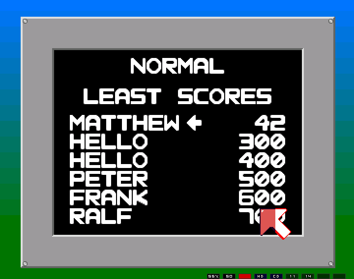
I'm also a speed demon (and a Ren and Stimpy fan).
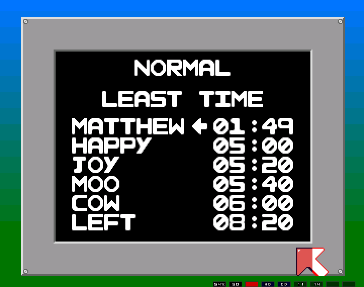
That's pretty much it. Nothing amazing but it does the job. It can be downloaded from: here.
The last bit of interest are the sound effects. This is the only game of mine where all the sound effects were created by me, and are, in fact, me! (Digitally altered of course, I didn't really talk like that... *cough*)
- Clicking a square
- Winning
- And the best... clicking on the "End" button to quit early
Toxic Waste
The Acme Toxic Waste company has sprung a leak and Toxic Waste is being delivered to the wrong people! You must help the ATW co. by building new pipes to contain the Toxic Waste.Toxic Waste was my attempt at a Pipemania clone. But before we go any deeper, let's see the title screen...!
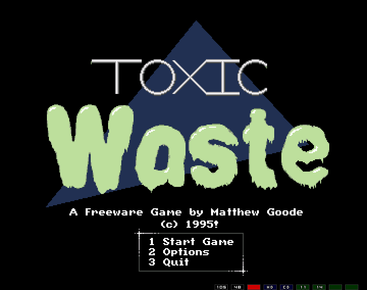
Now, those are depressing colours! And given by date-stamp, this is how I was spending my time studying for Bursary (last year of high shool).
Let's choose (2), options...
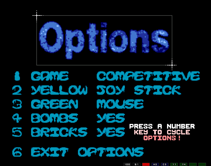
And this time, there are actually quite a few options, that actually have a purpose. The important things to note are the brilliantly designed text (do you like my "icky" font, it's uber snotty!), and the fact that the game can be played with two players, at the SAME TIME! A first for me, I think.
Let's cut to the game though.
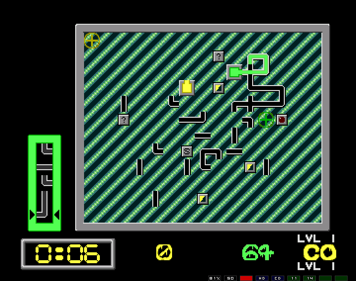
What's happening here? Well, yellow has karked it, and green is going okay. On the side is the upcoming pipe pieces, and you can see where the current pipeline is being developed (with slowly moving toxic waste). Hopefully you've played this type of game before so I won't go into much more detail (and it's pretty obvious) — if you haven't played it I suggest finding a suitable clone to ensure you have access to the full history of realtime puzzle games. Perhaps though, you may not have played it though because it's slightly harder to program than Tetris and therefore has not spawned quite so many millions of clones.
If not, the toxic waste only flows until the clock counts down to zero, so you just need to keep the flow going long enough for that to happen. Bonus points are scored for crossovers (the flow does not seep out the sides of the '+' pipes. Green is about to score a crossover bonus.
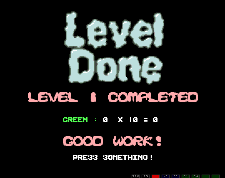
Finishing a level gives a not too imaginative screen, with interesting colour choices...
And since yellow "screwed up", we also get...
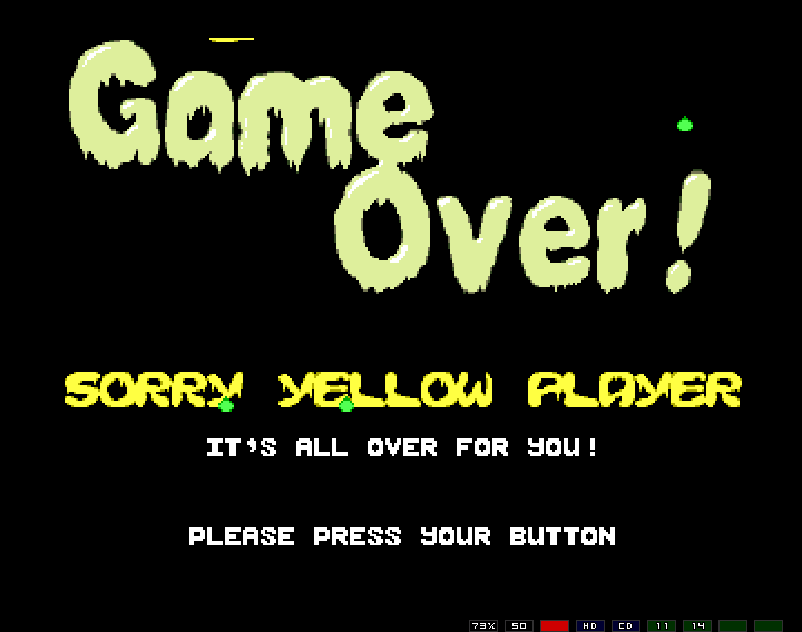
Note the droplets which are falling from the top of the screen to splash on the bottom — I was quite proud of these because they looked and acted reasonably realistic.
But player two is still in the game for level 2...
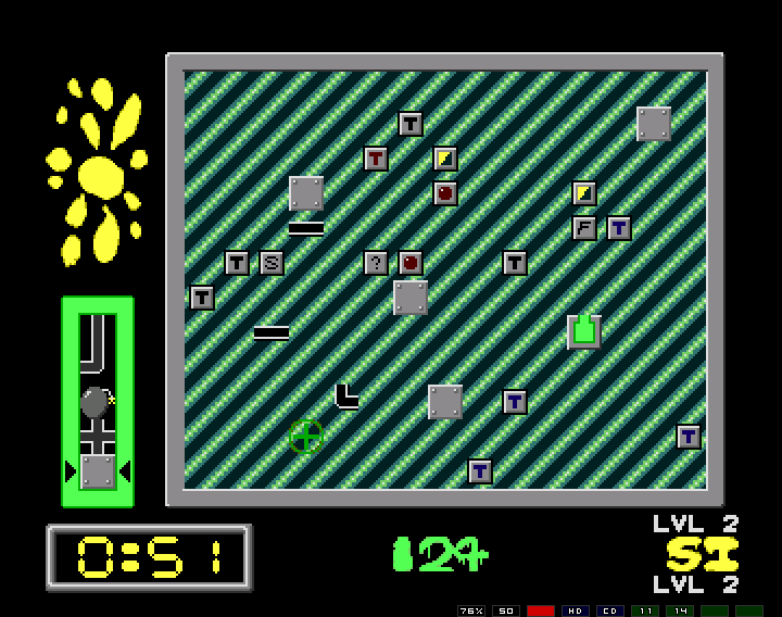
... but that's not too exciting apart from having more bits and pieces around. You may notice the bomb coming up on the left — bombs may be used for removing inconvenient pieces.
One of the crap things of my version is that each level shows no graphical variation. The background really needed to change but I'd lost patience in the end to do such things. You may also not all the strange little icon thingies everywhere. What do they mean? — see here!
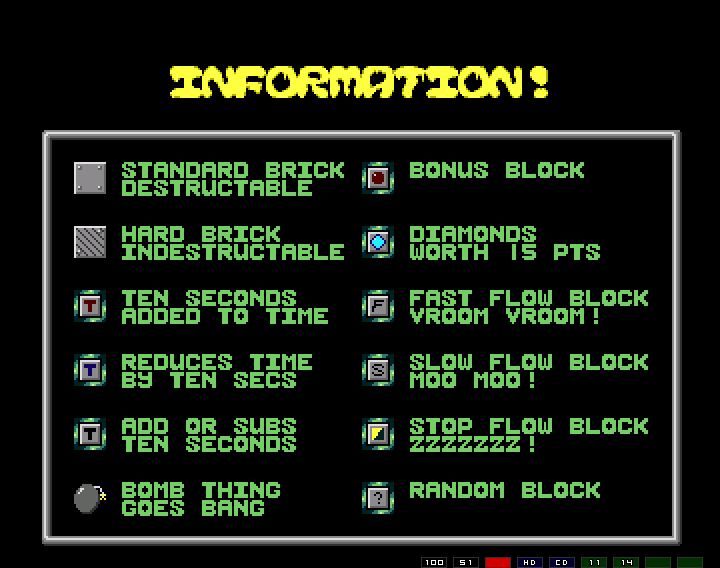
Answer your questions? I thought so. But player two dies, with a high score, and more droplets!
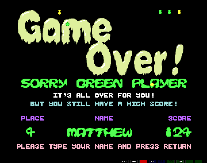
This leads us to the funky "High Score" screen...
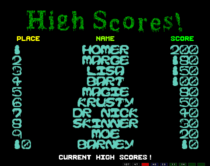
Notice the very subtle Simpsons references....
Now that is pretty much the whole game — not too exciting really. The interesting thing though is that I'd begun spending a lot of time on the little touches to my games. The fact is, the game was rather irrelevant. Everything had a intro/outro special effect, nothing happened abruptly — mostly it was subtle but enough to make it all seem "polished" (well, I felt it did). Examples of this are...
The title screen did not just appear, or even fade in; it expanded from the top of the screen, overshot in size, and then corrected itself. Here it is, part scrunch...
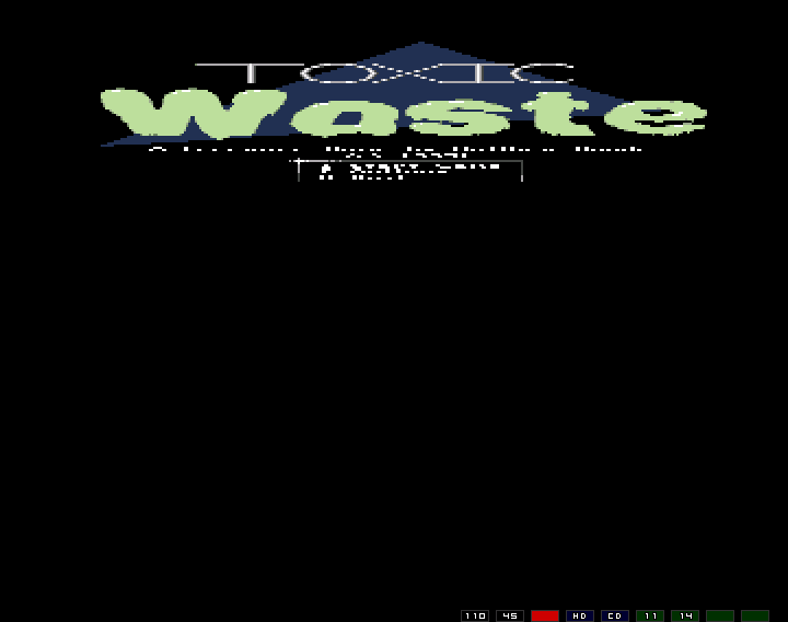
This was a common "demo" effect on the Amiga, and reasonably interesting because an Amiga 500 is simply too slow to actually scale graphics like this (most peoples today, really don't appreciate the phenomenal power in their computers), and in fact what is happening is not that the image is being scaled but how the image data is being fetched from the computer's memory that is being scaled. Well, it was cool to me. (It looks nice and smooth on a real Amiga - sinc'd to 50hz)
Other effects in the games were actually constructed using similar techniques. The high score screen used a simple "de-res"...
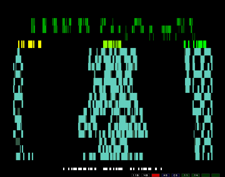
... which only "de-resed" on the vertical axis - though both axises were possible, I just wasn't quite up to it at the time (effort wise, and perhaps skill wise).
The main game screen "piled up"...
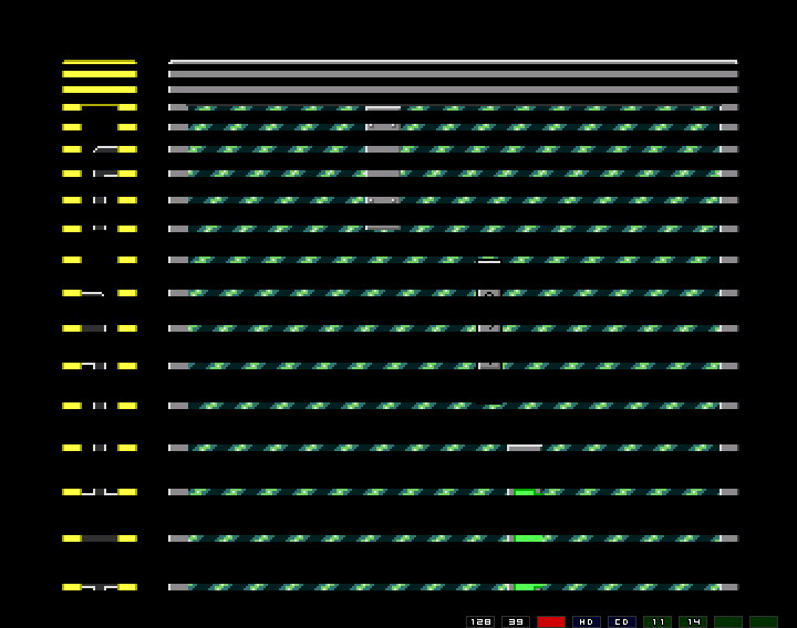
That effect is actually doable on a C64 which always impressed me...
The game also had additional touches like a pause screen...
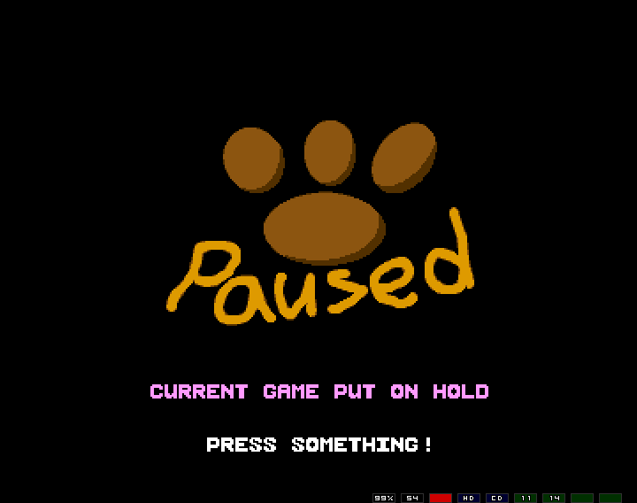
... and the strange "m" key screen...
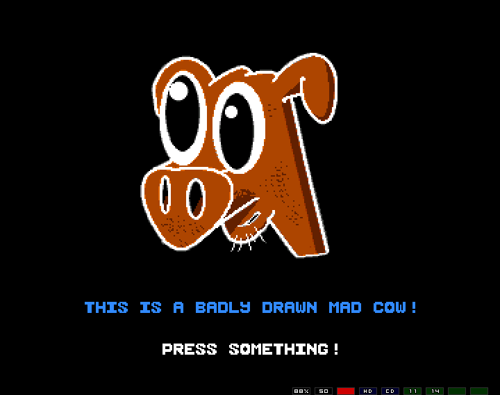
... which was inspired, but pale, imitation of the "Fruit of the day" screen in Pengo, by Martin Rebas.
Toxic Waste can be downloaded from here.